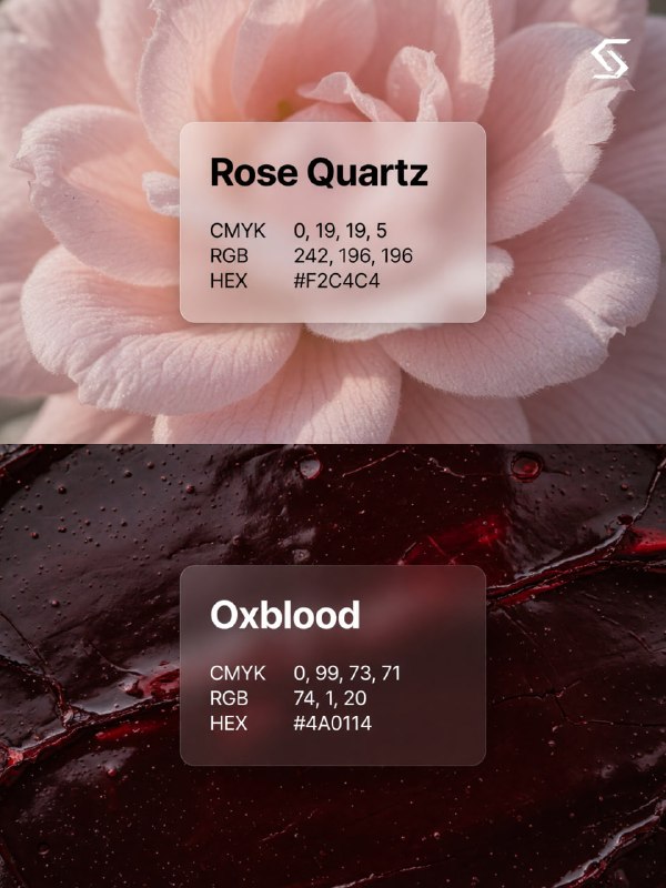
Собрал для вас подборку сочетаний, где каждый цвет – это не просто оттенок, а роль в композиции. Логика одна: у пары обязательно есть ведущий и поддерживающий тон, и они контрастируют по глубине, по температуре или по насыщенности.
Как это использовать
Генерация изображения:
A split vertical color palette reference poster.
Top half: macro photography of mint leaves in frost, close-up crystal texture,
pale mint-green tones, cool soft light.
Overlaid: frosted glassmorphism card, exactly 680×340px, rounded corners 28px,
ultra-light semi-transparent white background,
Onest font — bold 64px near-black title «Mint Sorbet»,
values in Onest Regular 28px: «CMYK 32, 0, 14, 11» / «RGB 155, 227, 196» / «HEX #9BE3C4».
Bottom half: macro photography of deep emerald velvet folds, close-up fabric texture,
dark saturated green tones.
Overlaid: frosted glassmorphism card, exactly 680×340px, rounded corners 28px,
deep emerald semi-transparent tinted background,
Onest font — bold 64px white title «Emerald Abyss»,
values in Onest Regular 28px: «CMYK 92, 0, 21, 79» / «RGB 4, 53, 42» / «HEX #04352A».
Both cards strictly identical in size and Onest typography.